Introduction
The objective of our “Pillow” project is to give users a simple, attractive web tool for discovering and comparing properties across the southern and southeastern United States. Using Vaadin Components for the UI, SMILE for clustering, Google Maps API for browser map display, and custom CSS styling, we built an interactive site where anyone can:
- Search by city or neighborhood
- See summary analytics at each geographical level
- Look into individual listings
Whether you’re a home buyer or an analyst, Pillow puts property exploration at your fingertips.
Design
Vaadin Flow
Provides <Select> dropdowns, <Grid> tables, and layout containers (VerticalLayout, HorizontalLayout).
GoogleMap Add‑On
Embeds an interactive U.S. map; markers focus on the chosen city or neighborhood.
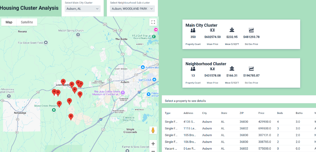
Grid & Dropdowns
Main City Cluster and Neighborhood Sub‑Cluster selectors drive both the map and the data grid.
Metric Cards
Icon + Span combinations display count, mean, median, standard deviation and $/sqft in a clear, card‑style layout.
CSS via getStyle()
Custom backgrounds, borders, spacing, centering and sizing ensure a clean, pastel‑tinged look.
Functionalities
CSV Loader (CsvService)
Reads every property’s details: address, price, beds, baths, sqft, HOA, URL, latitude & longitude.
Clustering Engine (clusterKMeans)
Partitions into ~16 city clusters; on demand creates up to 11 neighborhood sub‑clusters.
Metrics Computation (PriceStats)
Calculates count, mean, median, variance (σ) and price‑per‑sqft for each cluster.
Marker Management
Batches addition/removal of GoogleMapMarkers so only the selected cluster’s points show.
Detail Formatter
When a grid row is clicked, centers & zooms the map and shows a styled detail panel of that property.
User Guide
- 1. Navigate: Use the top menu to go to Full Map or Cluster Analysis.
- 2. Select Main City Cluster: Pick a city from the first dropdown. The stats card updates (count, mean price, mean $/sqft, σ) and markers appear on the map. The data grid lists every property in that cluster.
- 3. Select Neighborhood Sub‑Cluster: Activate the second dropdown once the city loads. Choose a neighborhood sub‑cluster to refine the map, stats card, and grid.
- 4. Inspect a Property: Click any row in the grid. The map recenters and zooms to that property. A detail box displays all attributes (address, price, beds/baths, neighborhood, sqft, year built, $/sqft, HOA, URL, coordinates).
What I Learned
Embrace Pivoting
Ambitious ideas often need adjustment, whether tuning K values, reworking layouts, or handling API issues.
Google Maps API
Integrating the map taught us about key restrictions, JS callbacks, and efficient marker updates.
Vaadin Styling
Using getStyle(), Flex layouts, and icon cards gave us control over spacing, colors, and responsiveness.
Iterative Design
Each new requirement (bold labels, scrollable tables, mobile resizing) reinforced the value of refactoring and testing.