Overview
The Normal Loss Function Visualizer is an interactive teaching tool built to make a dense inventory concept easier to understand. Instead of reading formulas in isolation, visitors can manipulate the inputs and immediately see how reorder points change expected shortage, stockout probability, and the overall cost picture.
Why I Built It
I wanted a clearer way to explain the tradeoffs behind inventory decisions. The normal loss function is useful, but it can feel abstract when it is only presented in lecture notes or a spreadsheet. This project gave me a way to turn that theory into something people can explore and learn from directly.
What the App Does
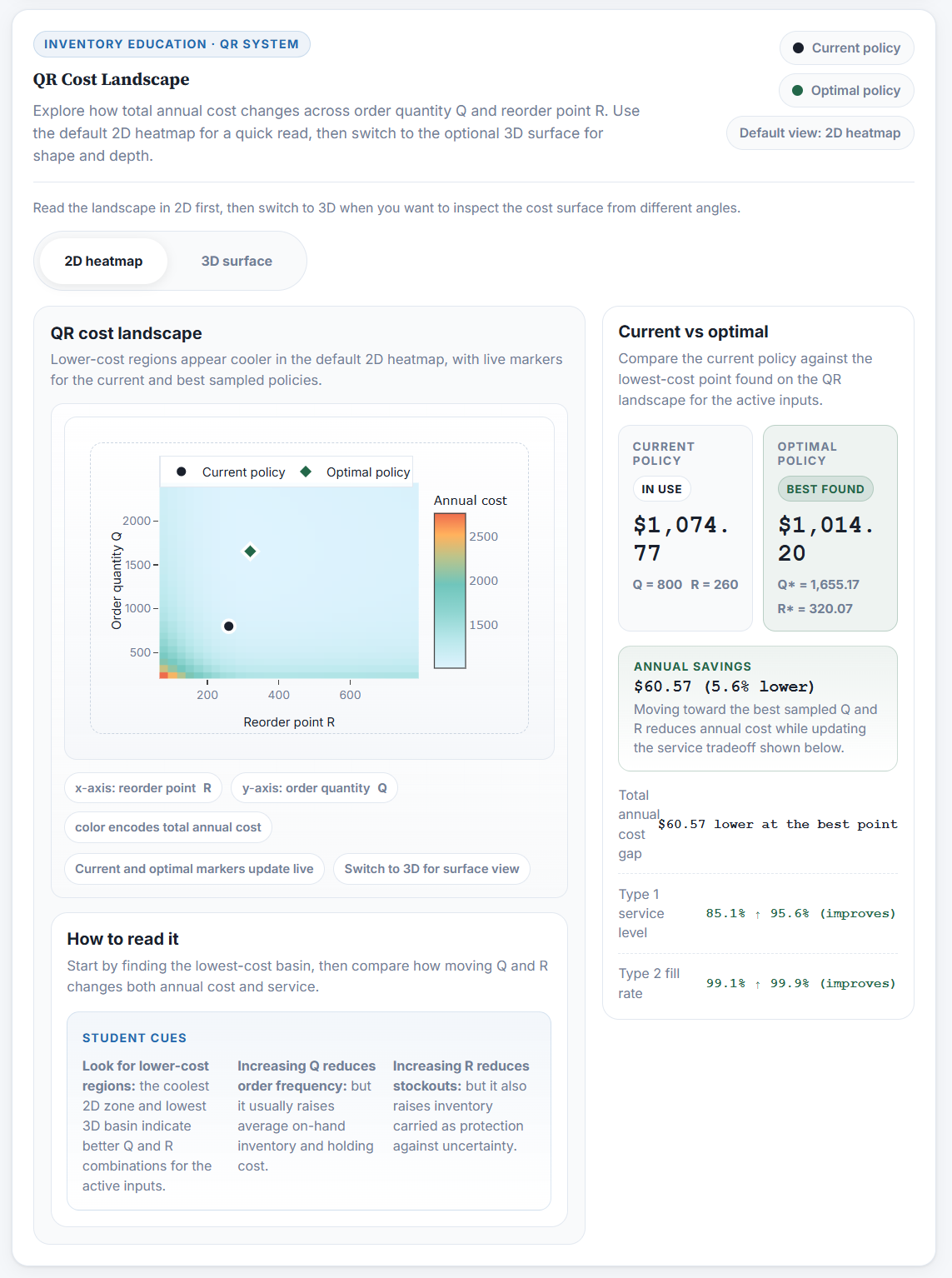
The app lets users adjust key demand and service variables, then see how those changes affect reorder points, stockout probability, expected shortage, and inventory costs. The goal is to connect the math to the business decision, so users can see both the model and the operational consequence at the same time.
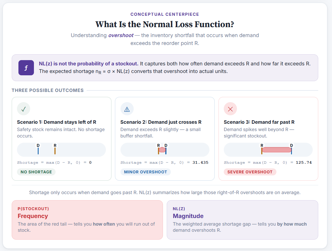
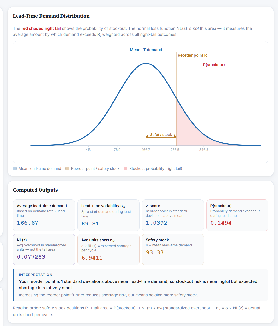
The experience is organized around a few core screens. The QR cost landscape helps users compare current and optimal policies, the conceptual explainer shows what overshoot actually means, and the lead-time demand distribution connects the visuals back to stockout probability, safety stock, and expected shortage.
Development Process
I approached the build as both a product and communication exercise. The core challenge was balancing accuracy with clarity: the calculations had to be trustworthy, but the interface also needed to stay approachable for students and non-specialists. I focused on making the inputs readable, the outputs immediate, and the visual flow simple enough that the learning path felt natural.
A big part of the build was deciding what each screen should teach. Rather than showing every output at once, I tried to group the interface into views that answer a specific question: where cost is lowest, what overshoot actually represents, and how the probability model connects to the decision rule.
What I Learned
This project reinforced how much better technical concepts land when users can interact with them. It also pushed me to think more carefully about interface design for educational tools, especially how to present a mathematically correct model without making the experience feel dense or academic.